Loubotin Nail Polish at Sephora

I photographed this special edition Christian Louboutin nail polish for the launch at Sephora. It's about eight inches high - totally practical! Sephora made it the centerpiece of their page for Louboutin, using a parallax effect to open the bottle as you scroll down.

I shot it another way for them as well, a little more jaunty.

Lyve

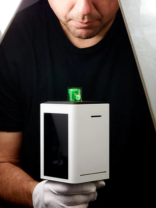
A company comprised of Apple and Google designers and engineers has created a system that might restore our relationship to personal photos. When Lyve contacted me and explained that their system collects all your photos from all your devices, organizes them, and lets you look at them and search them, it made me think.

Long ago, you used to drop your roll of film at the drugstore, and come back in an hour to get the prints (two sets!). You'd bring 'em home and look at them with the family, maybe give out a couple copies to relatives, put a few in an album, and one or two in a little frame on a shelf in the kitchen. But they'd be around, the rest of the photos, and sure, you might never pull them out of the shoebox from back of the closet, but you could, and you did, sometimes. And when you did, you'd get lost for a while, going back in time, looking at the prints.

Now, you take some snaps with your phone, send some MMS, receive some MMS, grab some pics off Facebook, your lady takes some pictures with her phone, your aunt is always posting Instagrams. There's pictures on Facebook, Instagram, iPhoto, Flickr, your phone, your kid's phone, your computer, your mom's computer, and they're always available...and they're scattered, in time and space and not really anywhere after all.

Ok, so that's long, but the Lyve Home stands a chance of mixing the best of both those worlds, and giving you more useful access to your photos.

So I thought it'd be good to help them launch it.


Client: Lyve Minds, Inc. Agency: NSG/Swat ...and the best crew ever.

New Website #4

It was high time for a new website around here.

Always improving things.

Always improving things.

I often see ADs on set, taking a peek at their mobiles: head slightly bowed, and the thumb flick flick flicking upward. And the same thing on desktops, just with the index finger instead. I wanted to keep things simple, have the biggest images possible, and support natural use. 

After a quick survey, I settled on Squarespace, because they were Johnny-on-the-spot with the customer service, and they have a template that does most of what I want. And that most is important.

100% what I want vs. enough of what I want right now? The answer to the question has important ramifications for the rest of your activities (ask Axl Rose). So, there are some things on the site I wish were a little different, but none of them are important enough to spend the time that'd be necessary to address them, mainly because while my website is important, it's secondary to making photographs. And it's in making photographs where good enough isn't.


Sephora Pantone Lookbook

Out now in all the Sephora stores, another cookbook, this time for the Pantone Color of the Year products.

We stayed with the usual aesthetic for the cookbook - overhead, clean, white. It's a challenge to do clean, white, and eye-catching, so I'm glad this set of products is about color. Color gives us something poppy to work with.

The big pallete is...big, like the size of an iPad. I think the AD did a nice job of incorporating it while preventing it from taking over the photograph.


Behind the Pyros

Every time it’s some new evolution, here in the pyro department at Rob Prideaux Photography.

These Quantum units greatly reduce the downtime. More shots means a greater chance for grandeur.

These Quantum units greatly reduce the downtime. More shots means a greater chance for grandeur.

I didn’t expect the fire to come through the holes in the shape of the symbol…even if I hoped that it would. But I did expect to frame up mostly metal. It turned out to be a lot more interesting to pull back, and show the background, and more importantly, the flames wrapping around the metal from the back. It was Phil’s idea to rig up the plates in a way that looked intentional, hence the twin, aligned C arms. Next time we’ll build something that fits in with the idea behind the photo.

And this’ll be the big evolution, which we’ll have to perfect next time…

And this’ll be the big evolution, which we’ll have to perfect next time…

…since this time was ad-hoc, and probably a fourth the size it needs to be to get the effect I want. It will look amazing though.

…since this time was ad-hoc, and probably a fourth the size it needs to be to get the effect I want. It will look amazing though.