Pushing Fire through Fancy Holes

This time around, I teamed up with Phil Spitler from Bonfire Labs. He's a Techshop aficionado and all-round genius.

He did the cutting, of both material, and of extraneousness. That’s just 1/16″ steel in the video, but he cut 3/4″ marble, and that machine will cut inches thick steel, with no scorching or warping.

_MG_4914.jpg

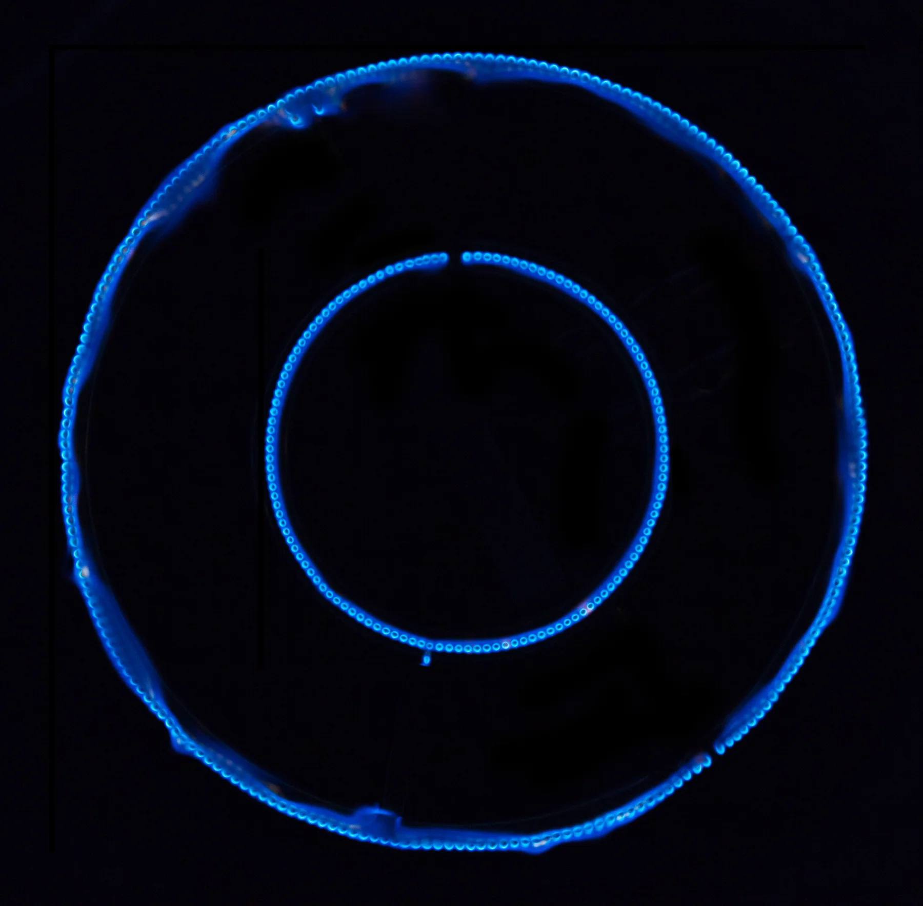
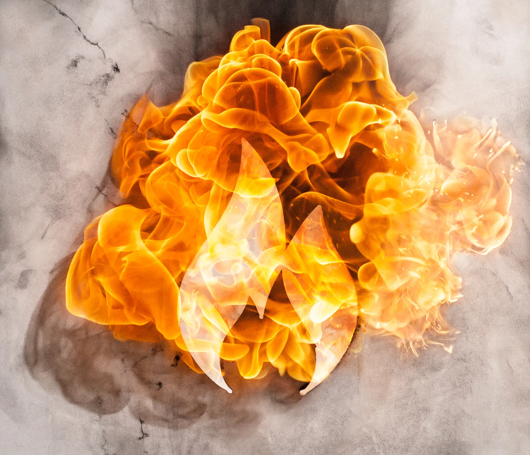
The last time I worked with shapes, it was just lines and squares, so this was a big step toward more robust shapes and symbols. I didn’t expect the flames to retain the shape of the aperture (oh, fire, I know you), but I wanted to see what would happen when we pushed the gasoline explosion through the hole.

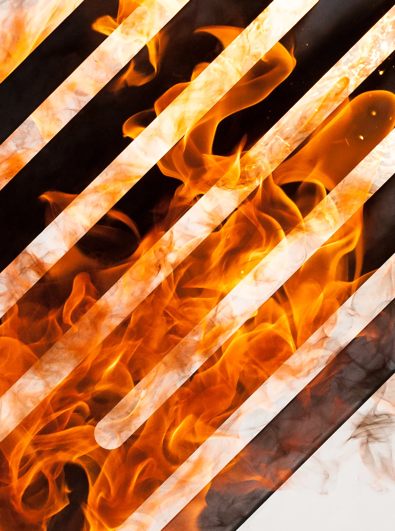
What’s interesting is the added sense of depth, as well as the ability to mix light and dark, and get the flames to appear in front or behind of something.

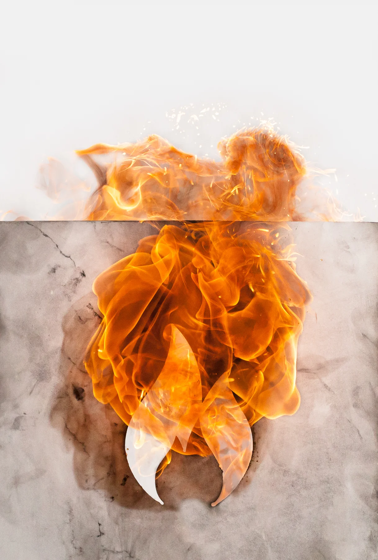
Here’s the Bonfire Labs logo – on fire. I’ve spent so much time and effort getting the explosions to look right on white, it’s a little strange to see, uh, not as white, in the mix, but the added elements and depth give the viewer more to savor.

And while the fire doesn’t retain the shape of the aperture, the difference in density between the material and the hole makes the symbol highly visible, and it’s working better than I expected – the Bonfire Labs logo is easily visible, beautiful, and well-balanced in emphasis.

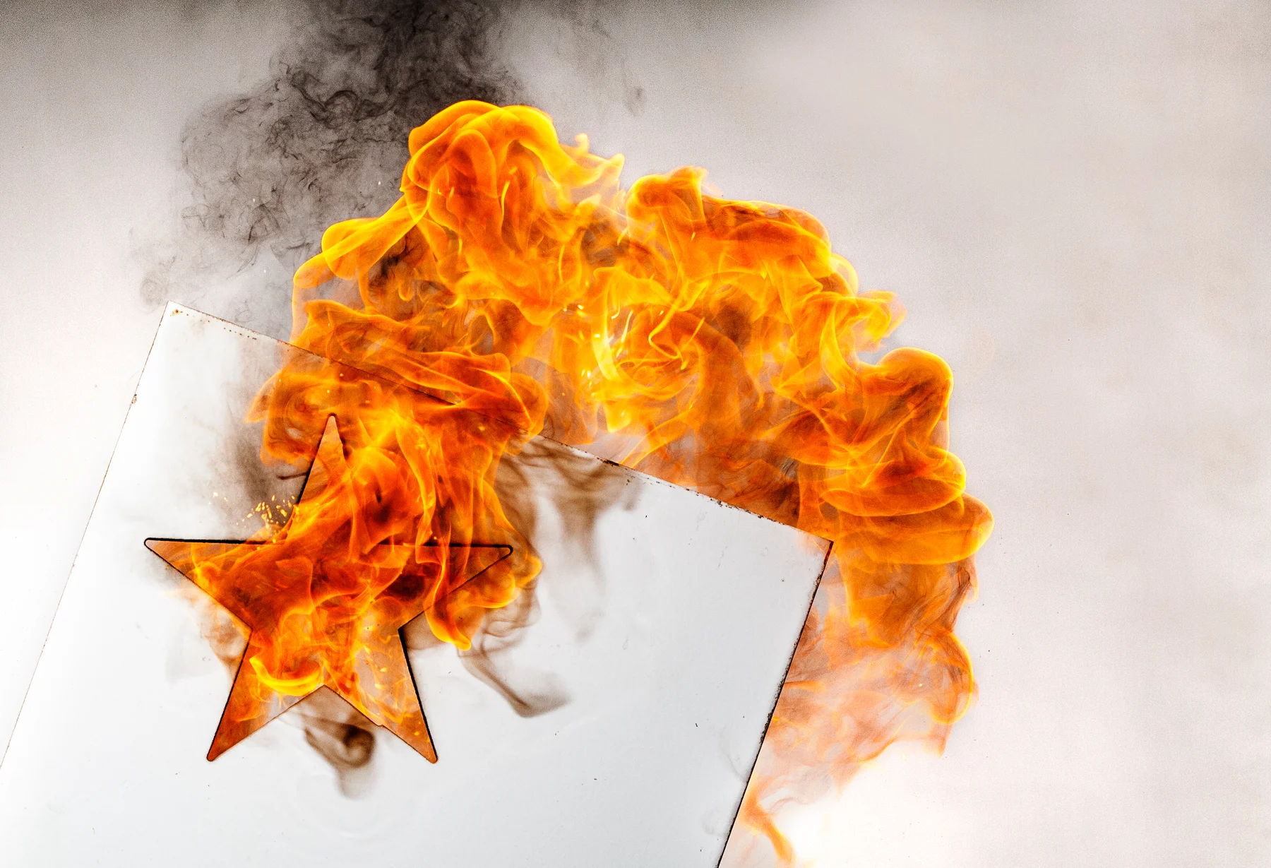
I’m loving this grubbier finish, with the smoke and grit. Unlike what has come before, but working really well.

This opens up a bunch of possibilities: multiple layers, different symbols, mixes of symbols, lettering, pictograms, white silhouettes against fire against white. A whole fantasy world depicted in flames!

Relaunching the Fuego - the iPhone of Grills.

Fuego Living contacted me early this year to help reintroduce their Element grill, a killer new design for a BBQ grill. To date, they'd been using CGI for their visuals, but they wanted art with a stronger point-of-view and a more authentic feel, and since I specialize in each, I was glad to help. We pulled together a crew in short order, and shot a whole library of product images over two days. The whole team was great fun to work with. The AD and I swapped notes on the latest (or oldest, too) music, and, since they were shepherding their first shipment of product, we talked with the founder about the challenges of modern manufacturing. Of course, food stylists and their clever tricks never get old, so we tried to get them to reveal the perfectly-curled-bacon method.

The grill is really attractively designed, and efficient as well.

The grill is really attractively designed, and efficient as well.

Not the sort of fire I usually work with.

Not the sort of fire I usually work with.


Speaking of logistics, sometimes you have to improvise: the Element comes in enamel (left), and stainless (right). The day of the shoot, we learned that the stainless version hadn't arrived. Disaster? I lit the enamel one to make it look like stainless, and saved us a bunch of ugly retouching.

We shot around a bunch, all casual-like, and did a series of different meals on the grill as well.

I worship at the altar of great products.

I worship at the altar of great products.


Is it for you? If you're short on space and value good industrial design, and a responsive company, keep an eye out for it - it's available nationally, and shipping soon. Bring yours by...I'll sign it!

Sephora Lookbook in All the Stores

I made these still-life photos for a Lookbook that went out to all 375 Sephora stores, around the world. The book's quite luxe - the glossy cover is die cut, and for each of four different looks, features a beauty shot of the finished look, instructions and techniques, and most importantly, a glamorous still-life of the products used. The art director and I spent two days arranging the products on white, which is...well, we just make it look easy. I greatly prefer working with the objects (and the set, and the crew) all together at once, as opposed to photographing each object independently, so I appreciated the art director's dedication to integrity. It makes lighting the scene a little more challenging, but it's nothing I can't handle, and it's well worth it for the feeling of authenticity the final image transmits.

My favorite, probably because of the red Marc Jacobs lipstick case, although...

My favorite, probably because of the red Marc Jacobs lipstick case, although...

This Dior compact is really nice.

This Dior compact is really nice.

The art director really pulled this one off, and it was a challenge.

The art director really pulled this one off, and it was a challenge.

This shot feels the most authentic somehow.

This shot feels the most authentic somehow.

And, no, I didn't photograph this, but it is the cover.

And, no, I didn't photograph this, but it is the cover.

Have you seen the book in the wild? Any favorite products in there? In what circumstance would you demo this eye treatment?