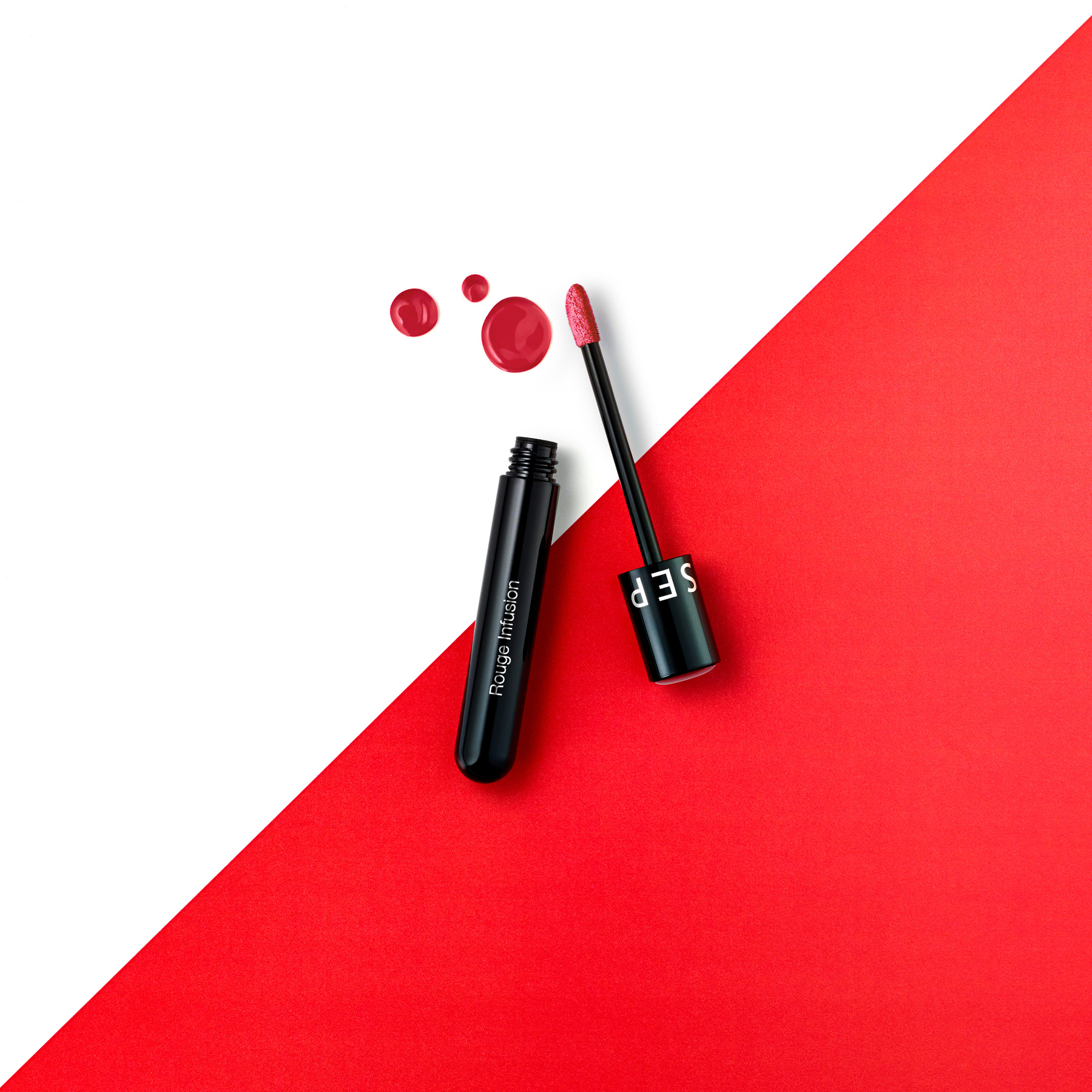
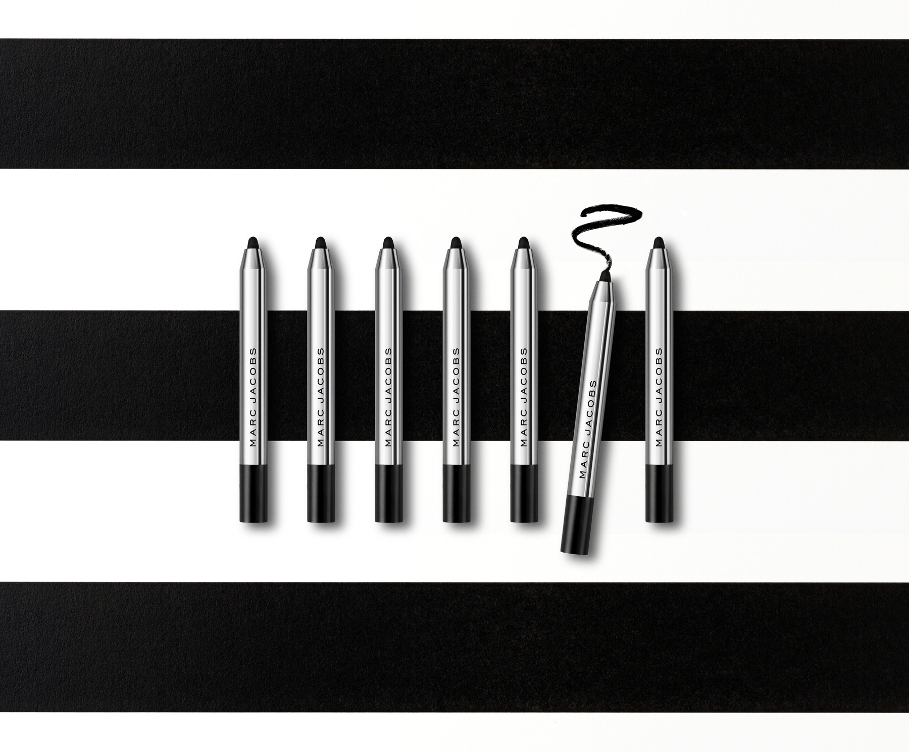
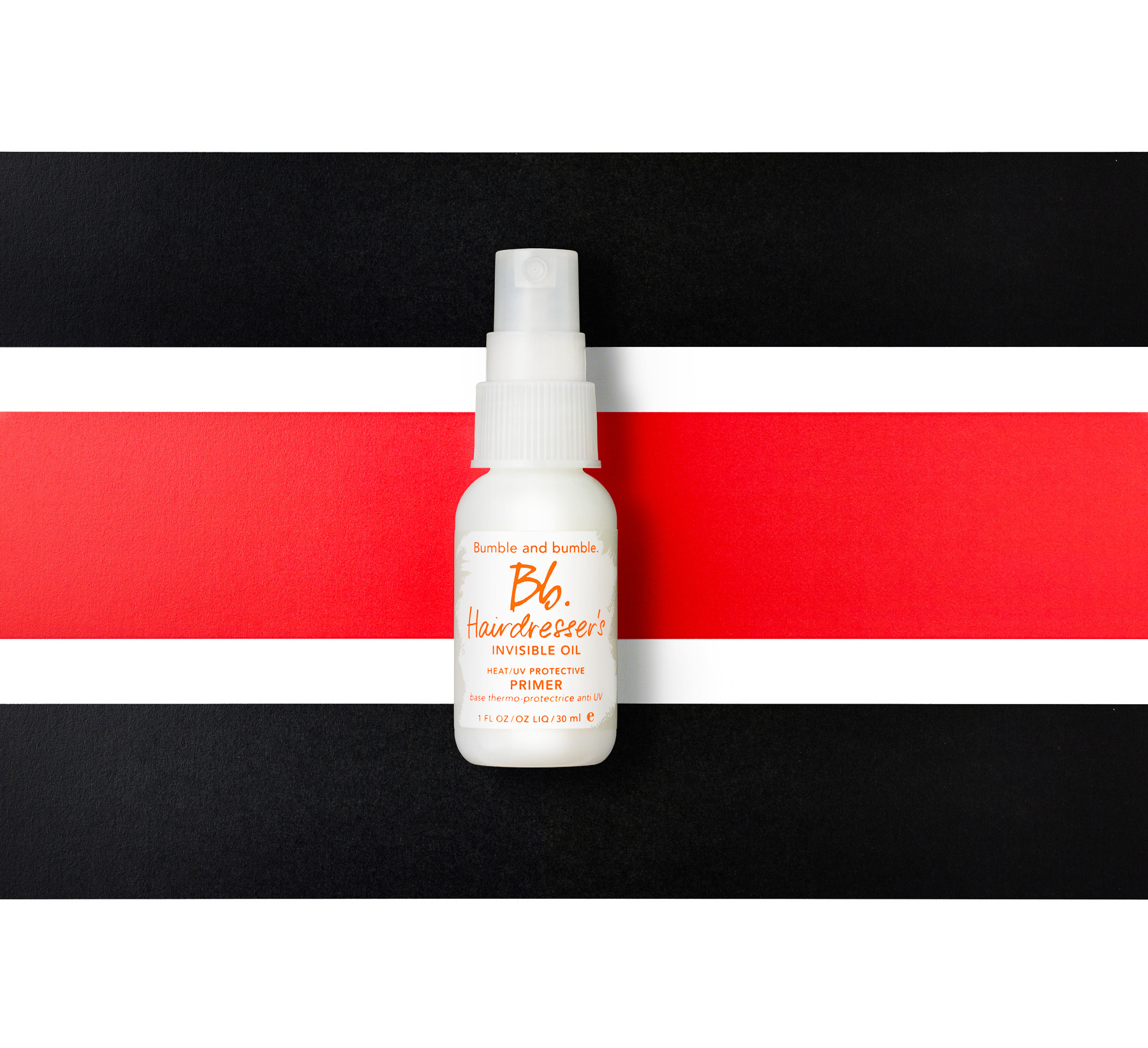
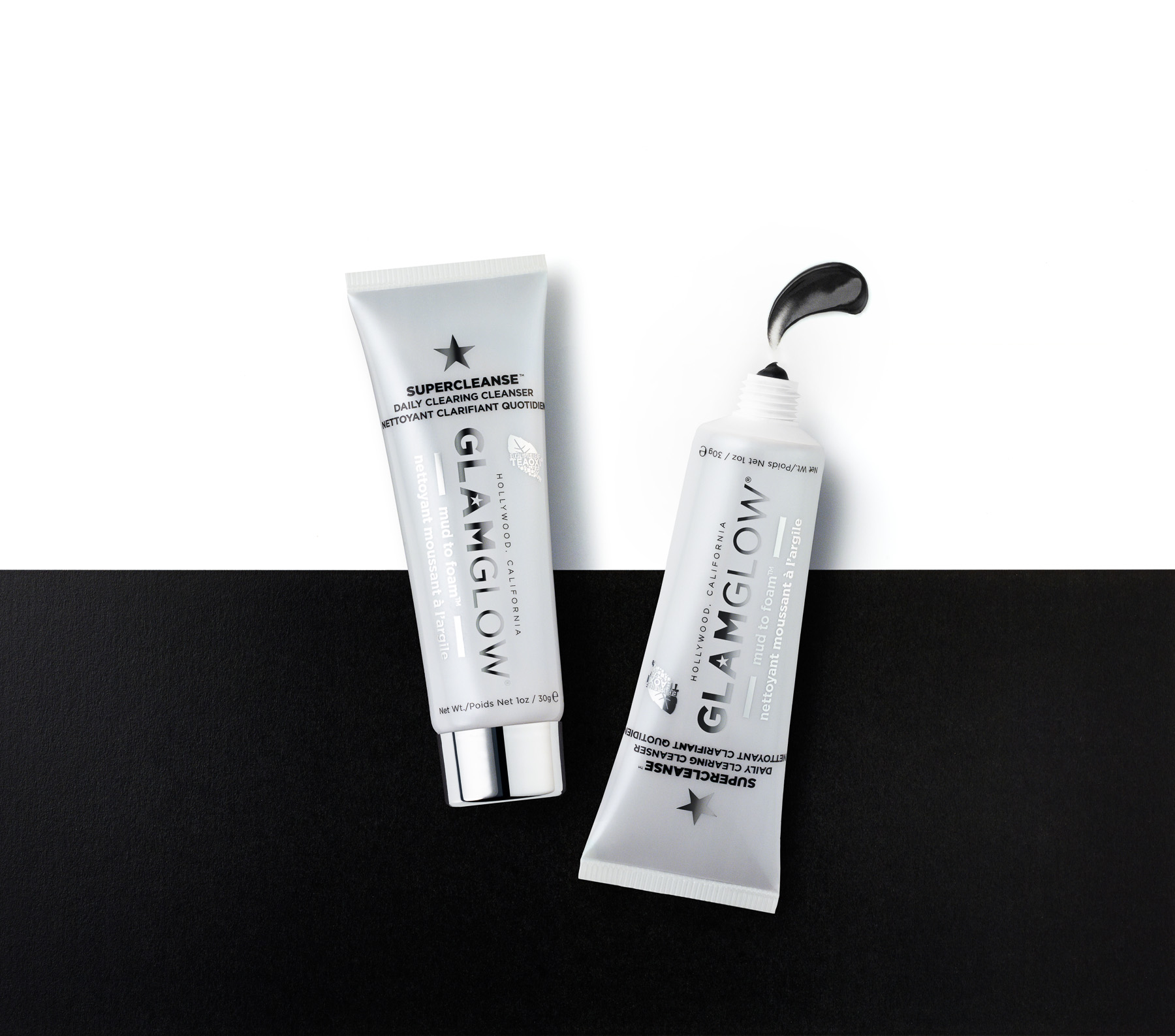
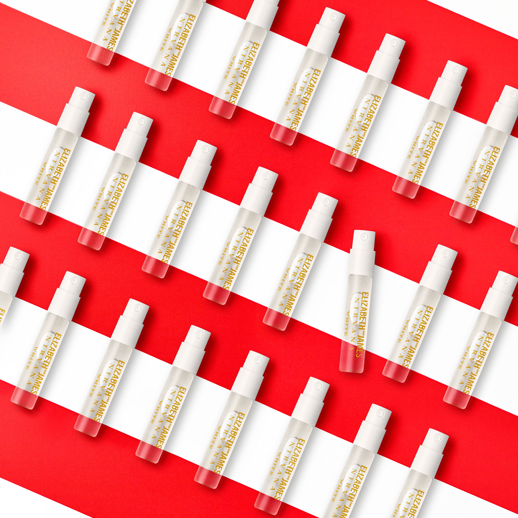
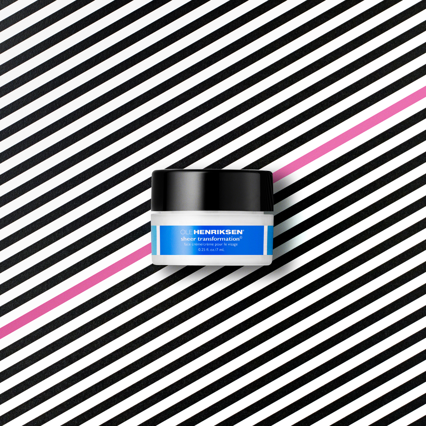
I shot these for Sephora Hot Now, awhile back. Simple.
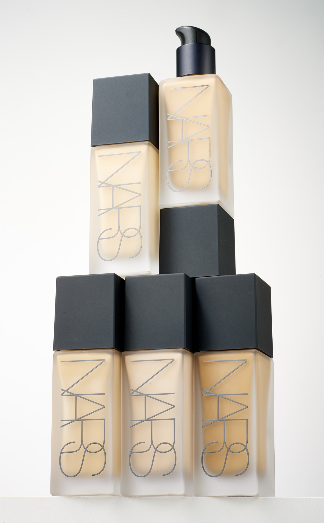
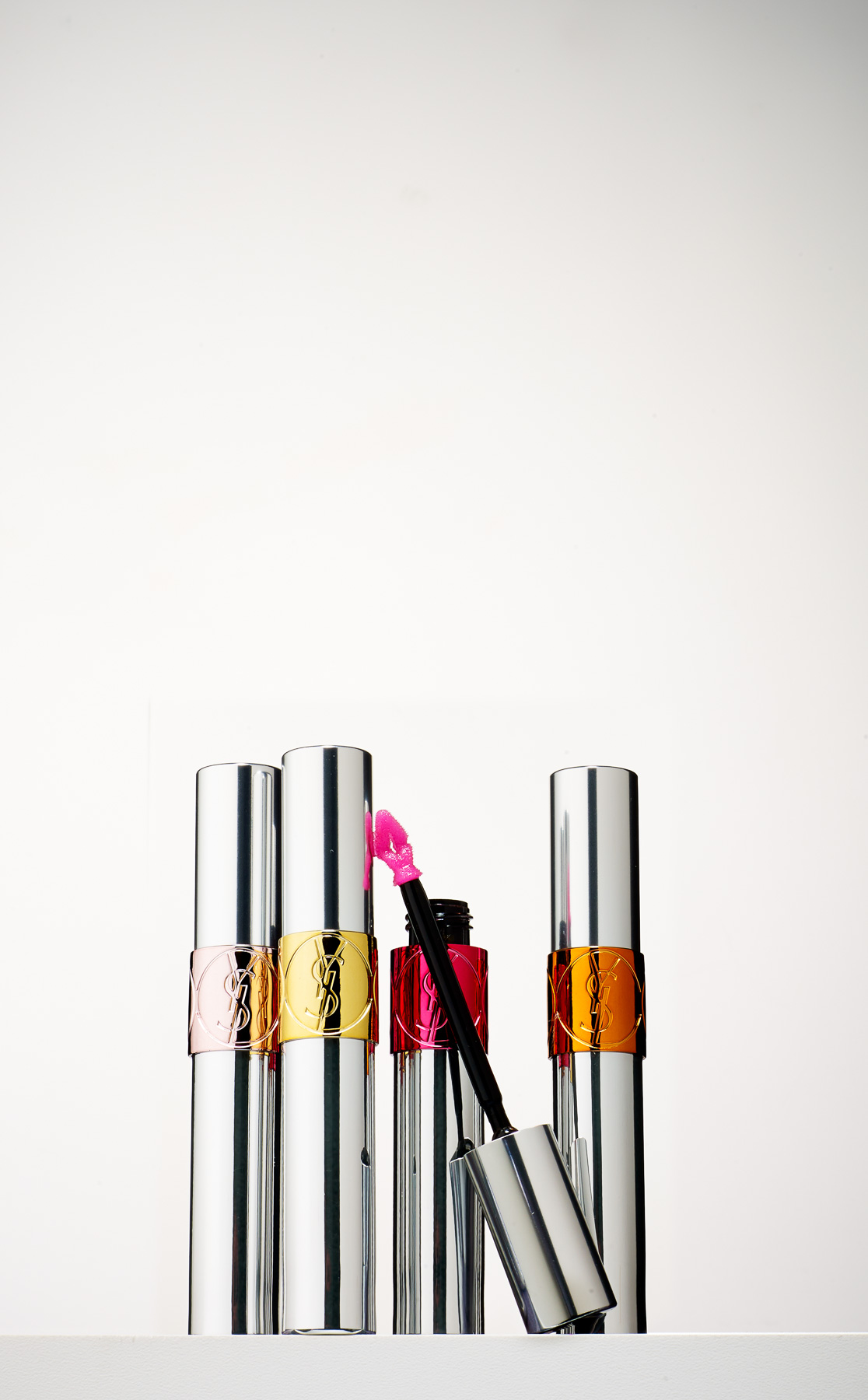
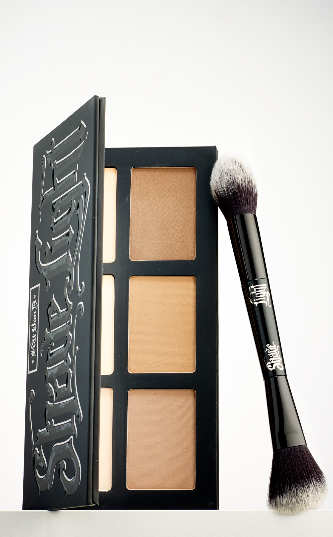
I shot these for Sephora Hot Now, awhile back. Simple.
I recently got a call from an editor at Oprah.com. We'd been talking for more than a year and she'd found a project for us to work on. The article was about health mistakes women make more than men, and I thought to myself, "Mistakes? Perfect!".
Don't let time pass if you're having a heart attack.
She described the article in more detail, and I picked up on the "supposed to do" part of each section, but was much more interested in the "not supposed to do" part, so, after we talked about it, that's what I shot.
Don't use the way your clothes fit to assess changes in weight.
As always, I'm more drawn to the anti-examples, and the cautionary tales. The photo editor did a good job picking me for this project. If I do say so myself.
Don't think your smarter than you're doctor because you skimmed something on WebMD.
I helped Sephora launch their new subscription box, Play! For $10 per month, you get a box full of deluxe samples of high quality beauty products. The program's been getting a lot of hype - so much so there's now a waiting list.
I think it's the photos.
Lens flares. And star filters! glass blocks! selective focus! cross processing! HDR! compositing! solarization! pinhole! polaroid! turbofilter! Instagram! Kodachrome! spot color! soft light! hard light! ring flash! desaturate! oversharpen! vaseline! double exposure! tilt shift! neon grid backgrounds! mooooooootion!
We love something until it's everywhere, then we decide it's passé. It's never really the fault of the thing, just our voracious capriciousness.
Years ago, I was working, as I always was, on a new portfolio. It was my first portfolio that was heavy on product shots. I sought feedback from a variety of people, but I remember the exchange with one friend as clearly as ever:
Friend: "There's a lot of black."
Me: "Mmm?"
Friend: "You know that's cheating, right?"
Me: "Nnnnnnhhhhh?"
He didn't need to say any more about it. I knew immediately what he meant - that it's easier to make a product photo dramatic against a dark background than against a light background. On set, it's easier to control the light (although there are ways to deal with that). It's easier to retouch, because the darkness hides a lot. Most importantly, the contrast of a dark background makes the objects look richer and more elegant - just like dark clothes, for people.
DRAB?
The shot above was part of the launch of the Pantone + Sephora Color of the Year collection, used across their digital channels, and it made sense to do it on white - it feels clean, descriptive, and approachable.
Nevertheless, for elegant drama, there's nothing like black. This MUFE shot was also for Sephora. In this case, the AD wanted more elegance and drama, so the dark background works better here.
And for the record, all the ways I was "cheating", so long ago? No need for them any longer, whether I'm shooting on white or on black.
