Darkness and Light at Sephora

Years ago, I was working, as I always was, on a new portfolio. It was my first portfolio that was heavy on product shots. I sought feedback from a variety of people, but I remember the exchange with one friend as clearly as ever:

Friend: "There's a lot of black."

Me: "Mmm?"

Friend: "You know that's cheating, right?"

Me: "Nnnnnnhhhhh?"

He didn't need to say any more about it. I knew immediately what he meant - that it's easier to make a product photo dramatic against a dark background than against a light background. On set, it's easier to control the light (although there are ways to deal with that). It's easier to retouch, because the darkness hides a lot. Most importantly, the contrast of a dark background makes the objects look richer and more elegant - just like dark clothes, for people.

DRAB?

DRAB?

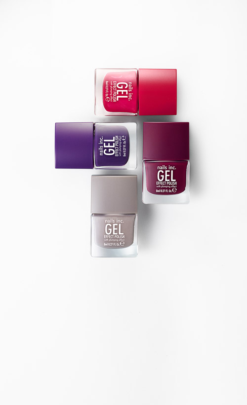
The shot above was part of the launch of the Pantone + Sephora Color of the Year collection, used across their digital channels, and it made sense to do it on white - it feels clean, descriptive, and approachable.

Fab?

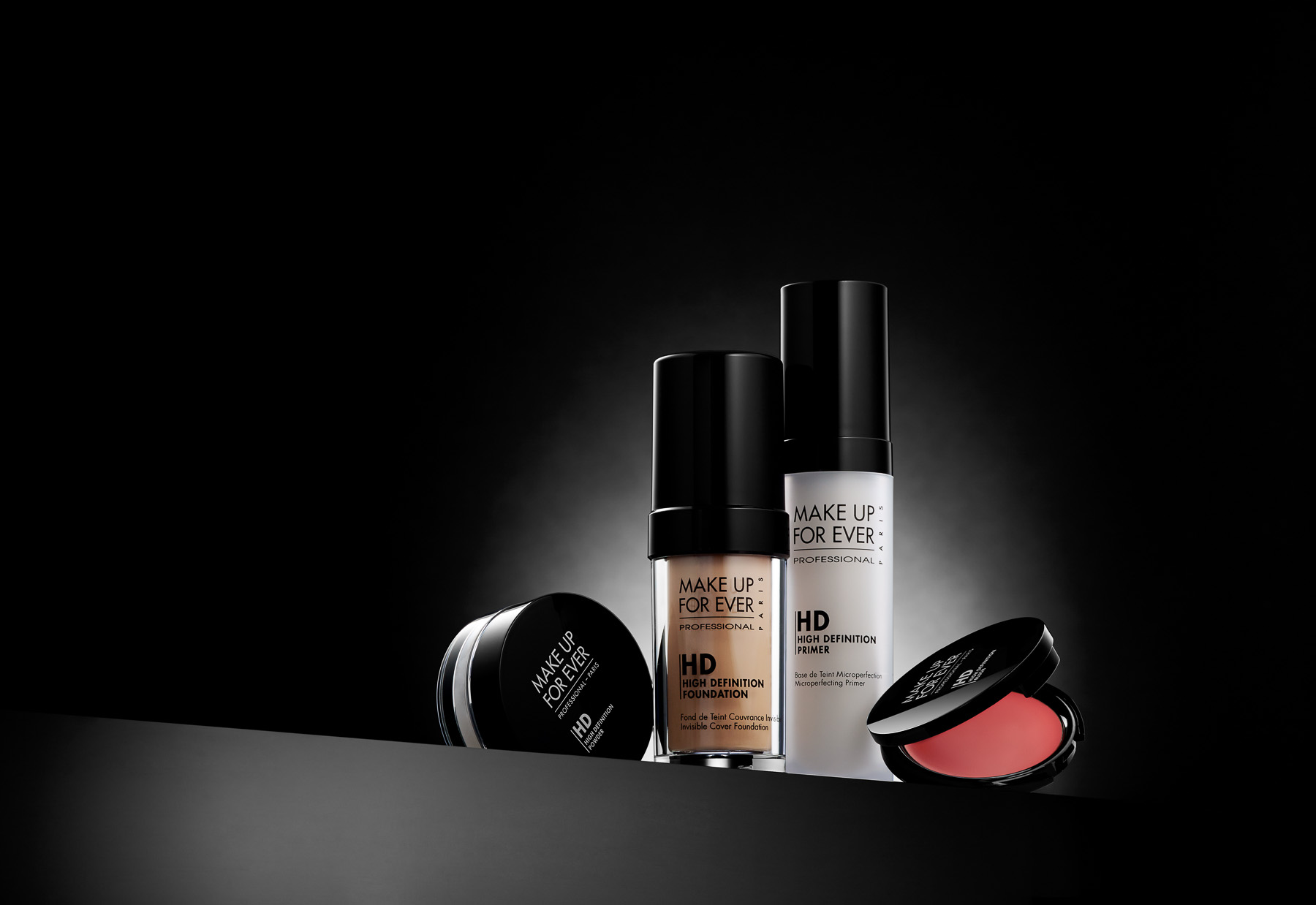
Nevertheless, for elegant drama, there's nothing like black. This MUFE shot was also for Sephora. In this case, the AD wanted more elegance and drama, so the dark background works better here.

And for the record, all the ways I was "cheating", so long ago? No need for them any longer, whether I'm shooting on white or on black.


Sephora Lookbook in All the Stores

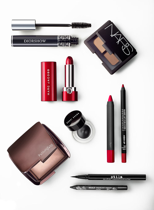
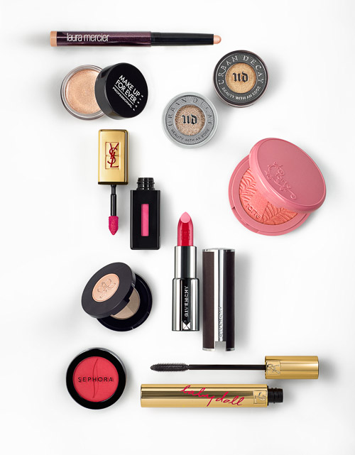
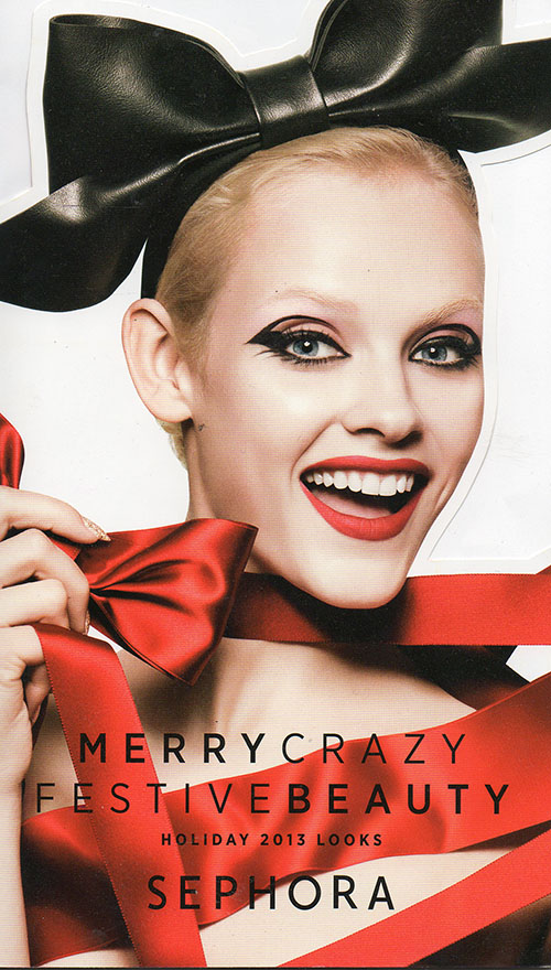
I made these still-life photos for a Lookbook that went out to all 375 Sephora stores, around the world. The book's quite luxe - the glossy cover is die cut, and for each of four different looks, features a beauty shot of the finished look, instructions and techniques, and most importantly, a glamorous still-life of the products used. The art director and I spent two days arranging the products on white, which is...well, we just make it look easy. I greatly prefer working with the objects (and the set, and the crew) all together at once, as opposed to photographing each object independently, so I appreciated the art director's dedication to integrity. It makes lighting the scene a little more challenging, but it's nothing I can't handle, and it's well worth it for the feeling of authenticity the final image transmits.

My favorite, probably because of the red Marc Jacobs lipstick case, although...

My favorite, probably because of the red Marc Jacobs lipstick case, although...

This Dior compact is really nice.

This Dior compact is really nice.

The art director really pulled this one off, and it was a challenge.

The art director really pulled this one off, and it was a challenge.

This shot feels the most authentic somehow.

This shot feels the most authentic somehow.

And, no, I didn't photograph this, but it is the cover.

And, no, I didn't photograph this, but it is the cover.

Have you seen the book in the wild? Any favorite products in there? In what circumstance would you demo this eye treatment?