Square Bottle Debut

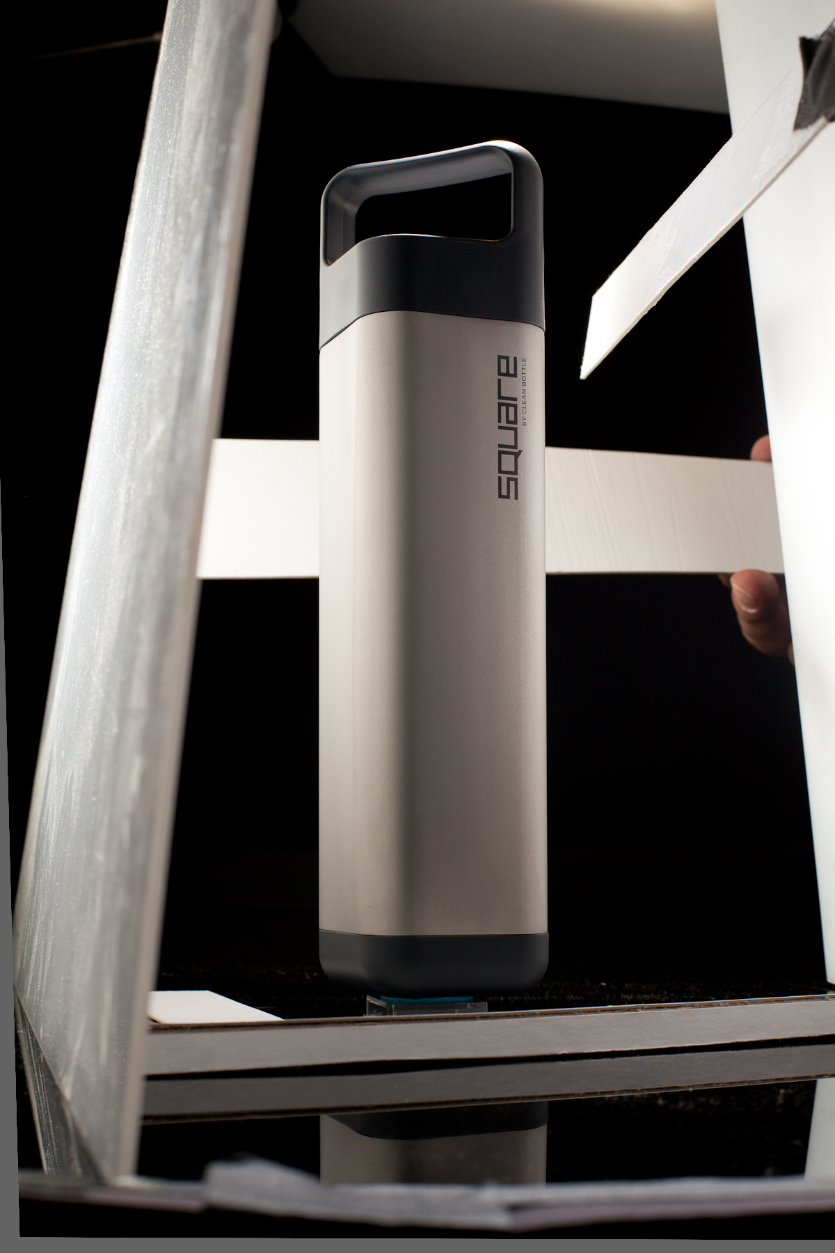
David from Clean Bottle contacted me recently. He's launching a new product, and wanted new photography to kick it off. 

square-1.jpg

We decided to do one heroic shot as a leader, and...

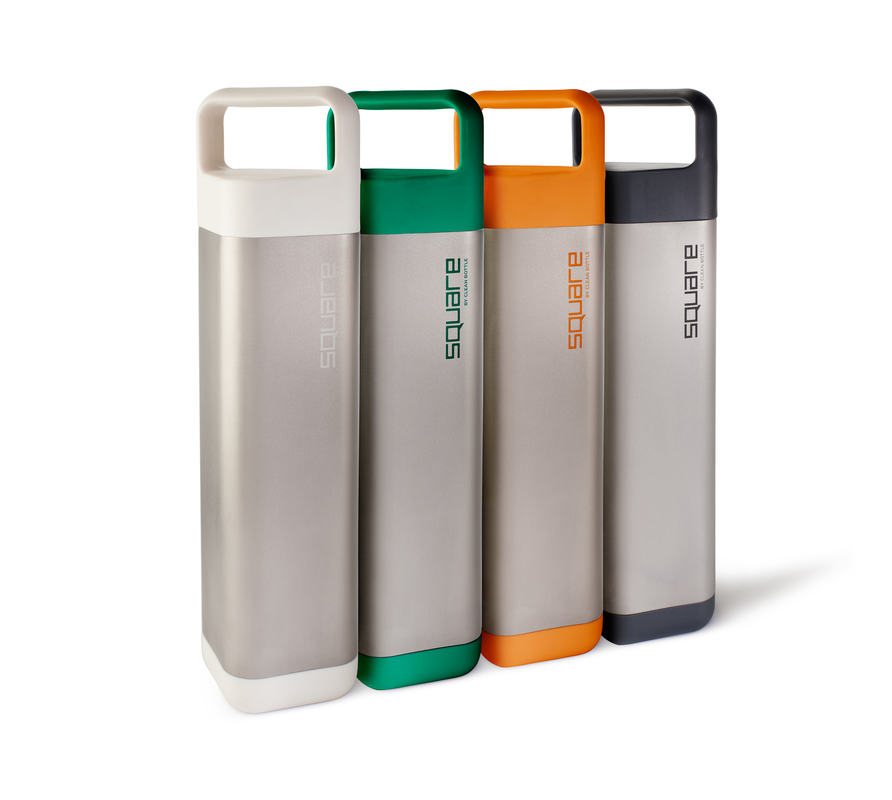
...a sort of survey in a more catalog style.

square-3.jpg

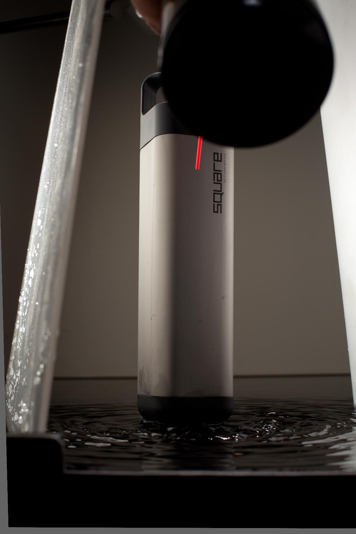
I wanted to do the water shot, and I wanted to give Dave a straight black shot, and I didn't want to light it twice, so I elevated it over black plex, and my assistant, Josh, built a short lip around it, to contain the water later.

To make ripples, we tried jiggling the plex, hitting the underside with a mallet, and streaming water in from a hose. After all, we found that shooting air down the front surface worked the best.

square-5.jpg

Channelling Irving Penn. 

square-6.jpg

The bottle comes in four colors, but at shoot time, Dave only had a black bottle, a white bottle, and two Pantone codes.

I created the green and orange bottles from the white bottle, and put the four together in post, although the group shot above was done on set. I am slightly allergic to Photoshop, and much prefer to get it in camera, but at time like this, it just makes more sense to do it in post. Getting the colors right, since "color" is such a complex phenomenon, took a lot of finessing with the hue, and the value, not to mention different qualities and colors of light in the various shots.

A fast, very technical shoot to kick off a very interesting new product!

More info: There's a Square Bottle Kickstarter on through Oct 11, and they're already 75% of the way there.

Clean Bottle Website

The Clean Bottle Boy at the Tour de France

Paper or Plastic

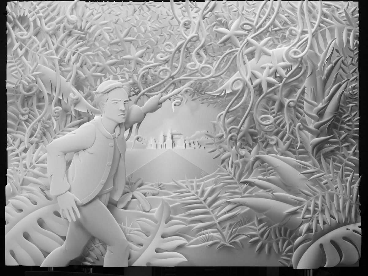
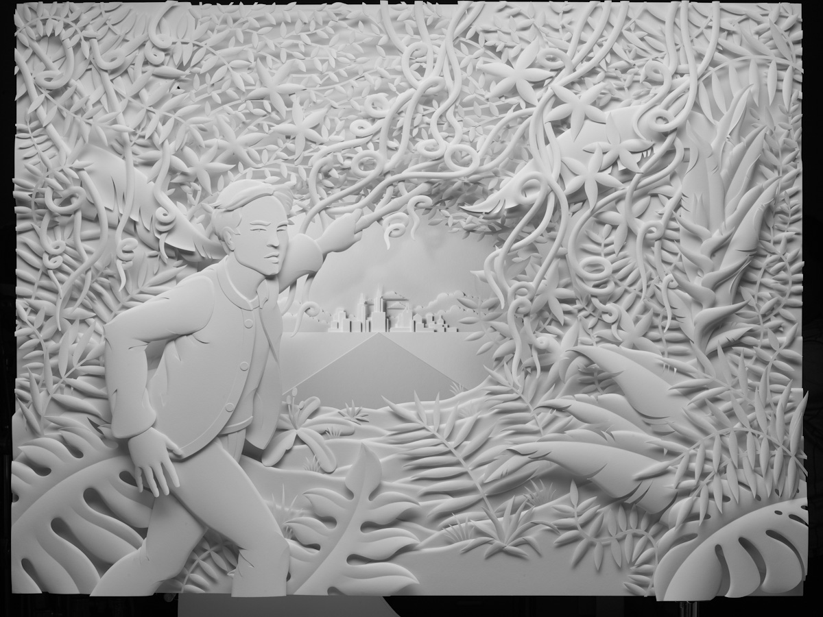
An ad I shot for EuroRSCG and Credit Suisse launched recently. It's part of a campaign to show how Credit Suisse helps their clients thrive, and it's a pretty big campaign, running in financial press, airports, and all over the web (press release here). So, that's a four foot by three foot sculpture made of paper, by LA artist Jeff Nishinaka. The easy part was that Jeff's sculpture does a lot of the work. The hard part was that my tools were really limited. I needed to accentuate Jeff's narrative without overwhelming it, and draw the user into an intriguing story, then let them realize they're looking at a sculpture. And I needed to do that without composition, color, or focus. All I had to work with was tone - black and white and everything in between - but just that.

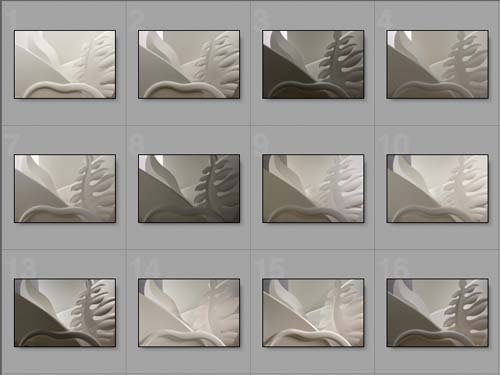
Jeff was kind enough to cut me some samples, and, about a month before the shoot, I spent an afternoon experimenting with different looks. I worked with a great art director, who wanted to see some variations. You see on there, looking more plastic than the other.

I had a fantastic crew down in LA, Jeff was a great host, and the whole thing was a lot of fun.

On the Credit Suisse site.

Wells Fargo Bank Ad

...or, Get In Where You Fit In. When Wells Fargo contacted me to use one of my images, in an ad campaign to reintroduce their retail banking operation to the NYC area, I was honored. When they told me which image they wanted to use, I had to chuckle.

Photograph of William Brady photograph of William G. Fargo by Rob Prideaux.