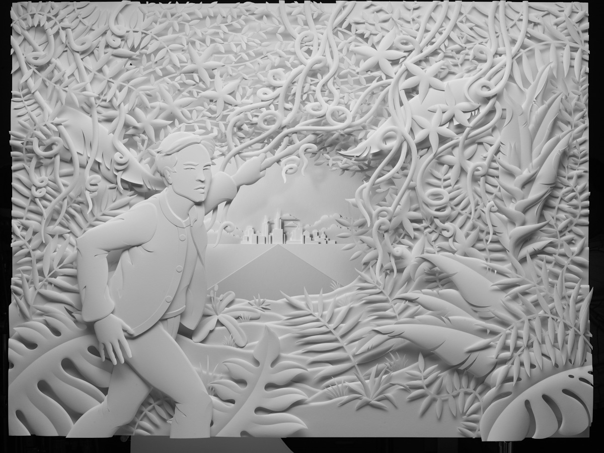
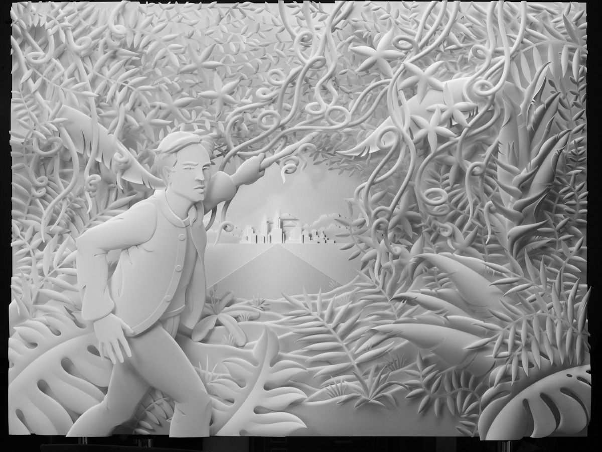
An ad I shot for EuroRSCG and Credit Suisse launched recently. It's part of a campaign to show how Credit Suisse helps their clients thrive, and it's a pretty big campaign, running in financial press, airports, and all over the web (press release here). So, that's a four foot by three foot sculpture made of paper, by LA artist Jeff Nishinaka. The easy part was that Jeff's sculpture does a lot of the work. The hard part was that my tools were really limited. I needed to accentuate Jeff's narrative without overwhelming it, and draw the user into an intriguing story, then let them realize they're looking at a sculpture. And I needed to do that without composition, color, or focus. All I had to work with was tone - black and white and everything in between - but just that.


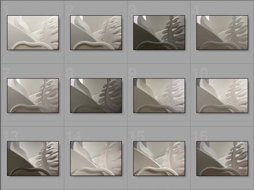
Jeff was kind enough to cut me some samples, and, about a month before the shoot, I spent an afternoon experimenting with different looks. I worked with a great art director, who wanted to see some variations. You see on there, looking more plastic than the other.
I had a fantastic crew down in LA, Jeff was a great host, and the whole thing was a lot of fun.

