Selected for APA National Awards

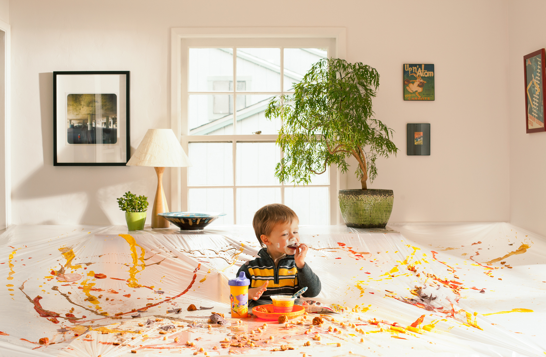
I'm pleased to announce that one of my images has been awarded second place in the still-life category of the APA Awards. I made this awhile back, dealing, as often, with parenting. The picture has picked up traction recently, which is nice, and I'm happy to be in good company in the competition.

Go see the rest of the winners.

Or, have a gander at some more off-kilter reactions to parenting.

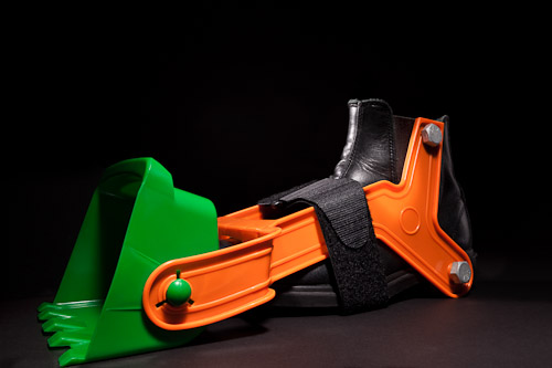
Helpful Ideas for Busy Dads: Toddler Edition

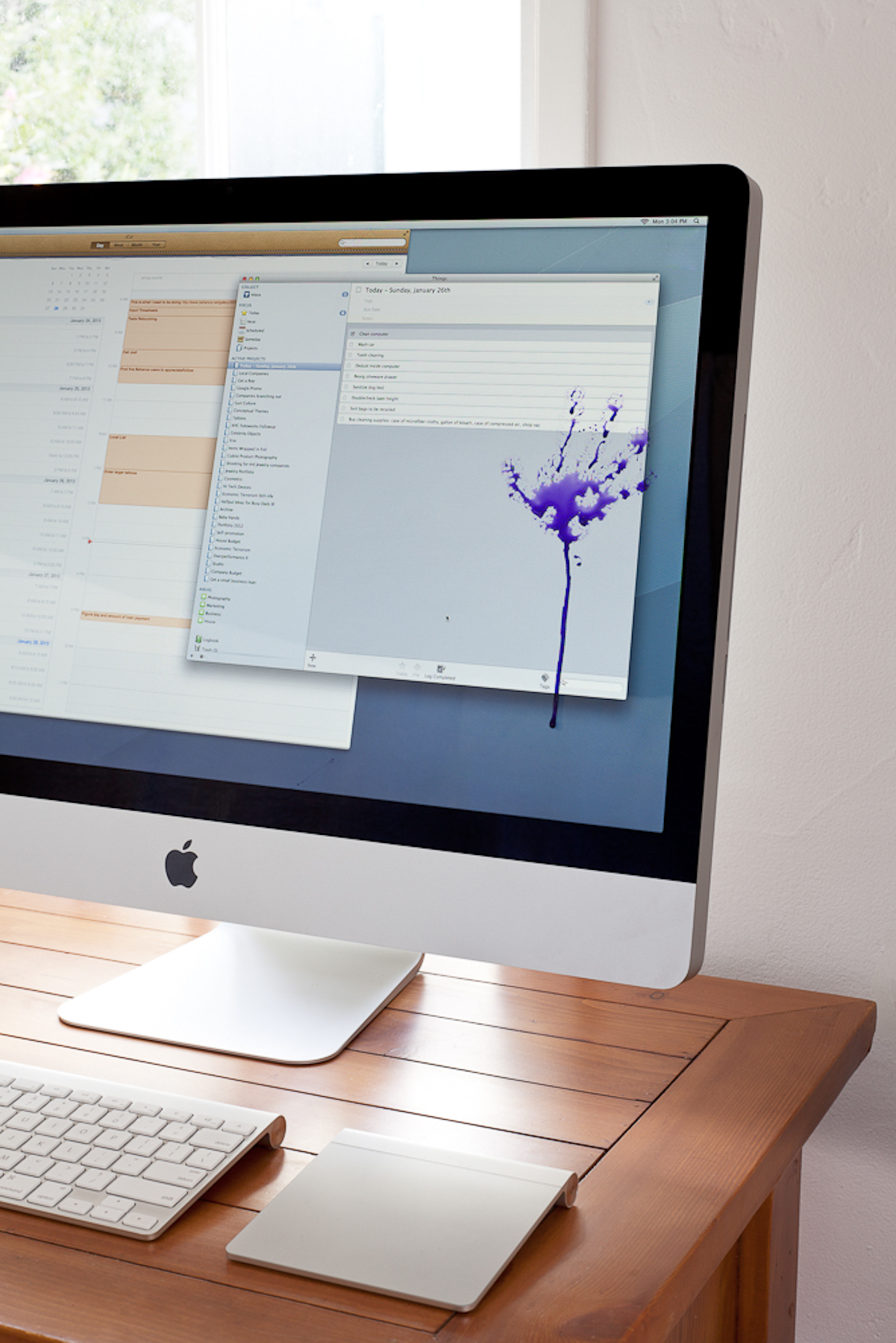
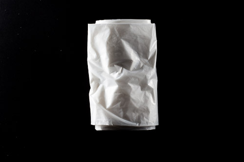
Following up on the success of the original Helpful Ideas for Busy Dads, I've created a batch of new, time-saving ideas for dads everywhere. When a regular bib is insufficient, try MaxiBib.

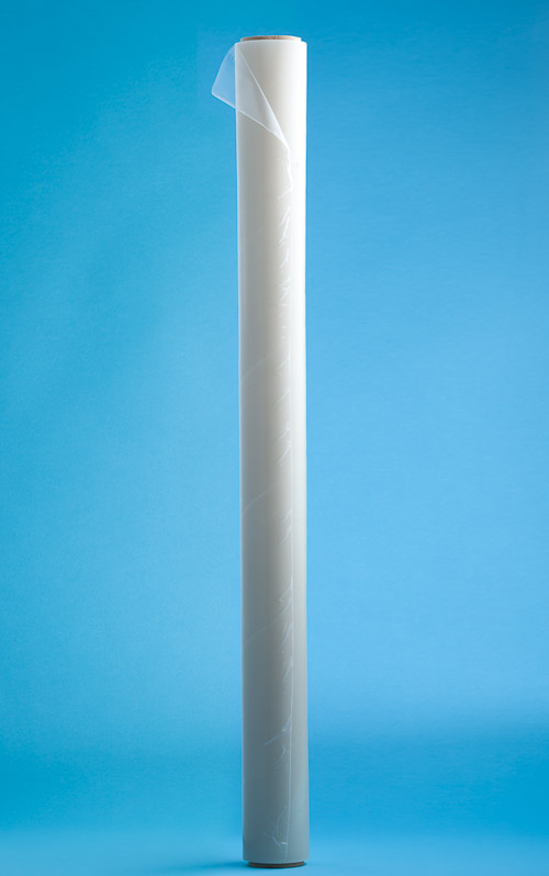
The Peel-A-Wall system makes art project cleanup a snap.

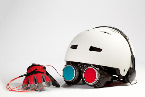
Rain or shine, the Park VR system keeps youngsters occupied, if not exercised. iPhone not included.

And for a big detour into fake backgrounds and product photography, see here.

Real and Unreal

I met with an editor, who suggested that my photographs that have even a little bit of interest in the background, versus a plain background, are much more interesting. And I think that's true.

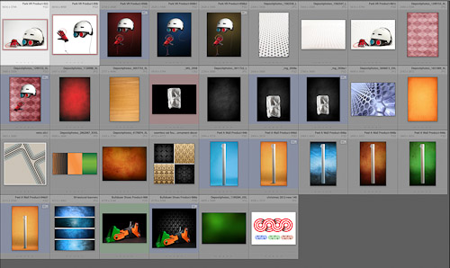
So, for the new Helpful Ideas for Busy Dads, I wanted to do a product side for the series, so I shot the objects on plain backgrounds:

And then I had that meeting with the editor, and I thought I'd experiment with different backgrounds.

Some of them turned out fine, and others turned out OK, but all of them are everything I hate about contemporary photography, unfortunately.

And then I remembered some other words I'd written, on compositing, and I realized that if I want to do more interesting backgrounds, I need to have them in the studio with me. Which really is a lot easier than this other thing, not to mention a better result.

There's a reason tabletop studios have entire rooms filled with backgrounds and surfaces.

Addicted to DIY Promos

Over the last six months I've made three promos at the office, and I think I'm addicted now. It started with a suggestion by Chris Milliman. He said he'd been sending out small collections of prints to select buyers for some time, and always got really good feedback.

Frankly, sending out 2034872304563056 emails or postcards is really not that appealing to me anyway, so I thought I'd give his method a try. I have found that it takes a lot longer to create a promo in this way, but it's not only more satisfying, but puts a certain wind under my wings when it's time to do the follow-up calls.

Last time it was the Make Shoes Move promo>. This time, Helpful Ideas for Busy Dads.

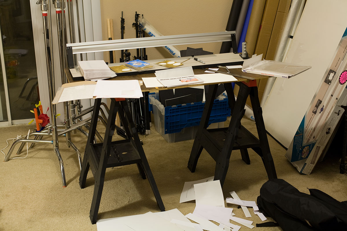
Design phase. If I ever wanted to call myself a designer, I have a long way to go.

Production phase. See the difference?

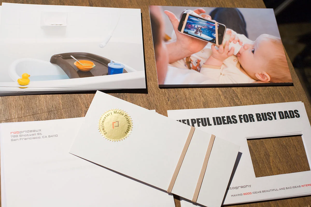
The genius part of this promo is including the Free Sample Media Player Caddy. Everybody loves a free gift.

_MG_3266.jpg

I do like the glassine envelopes.

I did the window so I could show a photo, but not give the entire photo away. I toyed with the idea of making up a whole fake company that might produce things like this, but decided it would best to stay with one brand, mine.

After you look at the pictures, there's the Media Player Caddy, in all it's glory, followed up the Ol' Call to Action.

The question I come up against is about Handmade vs Machine Made vs Handmade that Looks Machine Made. I'm not sure where I am on that scale, or where I even want to be. Handmade is charming and personal. Machine Made is fast and inexpensive. And Handmade that Looks Machine Made might be the worst of both worlds, since if people think it's mass produced, all the charm disappears.

We'll see. Meanwhile, I end up putting in a lot of work and ended up with something I'm proud of.