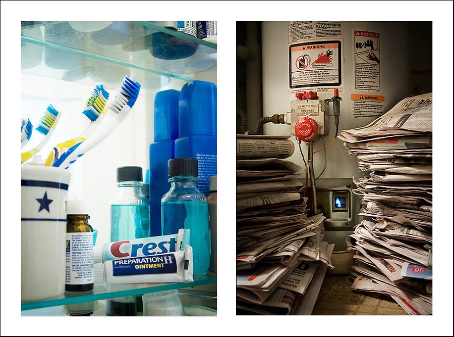
Several years ago, during my second portfolio build process, I had many pages that had two images side-by-side.
This made sense to me, primarily because I created these images at the same time, in the same project, to convey the same idea. The theme is consistent across both images. I sat with Thomas Broening to review the book, and, about all these pairings, he had this to say:
When you put two images together, one plus one should equal three; all these are like, I don't know, one plus one equals 1.85.
As we talked about it, I began to just get a sense, a whiff, of the possibilities of combinations of images, and that I'd been looking at pairings in a very simplistic, dogmatic way. Which I'm sure I'm still doing, 'cos I'm kinda authoritarian that way. But still, it's nice to shoot for improvements.
So I'm rolling up my PDN Photo Annual submission candidates, and I've rearranged the Resolutions series I did early in the year. At that time, I'd conceived the images in threes, but I've taken the best images and recombined them into what are hopefully subtler, more effective combinations.
How do these work together? Is there synergy, or just repetition? Is there a visualistic, a thematic, a moodalistic, a formalistic connection? All four? None? Is there tension or harmony, or points of tension and harmony in each? Do obvious size disparities create story material or merely distract? Is it too direct, and if so, is it like a wake-up call or a punch-in-the gut?
Just trying to make 1+1=3.


